Blog

A Night In Monet's Garden || Elementary Art Show Inspiration
Looking for inspiration to put on a spring art show? Check out this art show themed around "A Night in Monet's Garden". An art show filled with color, beauty, and created with lots of love and collaboration!
Learn more
The BEST Way to Hang Student Art for an Art Show!
Looking for the most efficient way to hang student artwork for a school wide art show? Well look no further! Click through to follow the 6 easy steps that will save your time and your sanity and are art teacher approved!
Learn more
Celebrating Black Artists in School
Last year for Black History Month, I really wanted to find a dynamic way to highlight and celebrate the work of some of my favorite Black artists. While my students were all hard at work creating art projects inspired by many of these artists (Tar Beach collages by Faith Ringgold, self portraits inspired by Amy Sherald and Vanessa Brantley Newton, etc...) I decided to create a singular bulletin board of all of my favorite black artists as a way to kick off the month. I first chose to create simple illustrations of each artist. The artists I chose to draw were Bisa Butler, Faith Ringgold, Kehinde Wiley, Jacob Lawrence, Amy Sherald, Jean Michel Basquiat, Alma Woodsey Thomas, Romare Bearden and Vanessa Brantley-Newton. I began by sketching them out on brown paper with a white pencil, and then tracing over my lines with a chisel tip sharpie and a bingo dauber filled with India ink. I only had one shade of brown paper on hand, but I think drawing them on a variety of brown shades would have been really lovely as well. When drawing each artist, I really wanted to keep them in a monoline so that the pop of color would come from their art above. Once each artist was drawn and traced, I cut them out and mounted them on bright fluorescent bulletin board paper for contrast. I then printed up one piece of art by each artist, then mounted them on brown paper drawn as a frame. Perhaps the trickiest part was the title of the board due to the size and the location I was envisioning. Spending more time then I'd like to admit drawing each letter on bulletin board paper, I was finally able to cut out the letters and mount each one above the board- using sticky tack to hold. Of course a Critcut would probably have saved me a ton of time, but I am a granny and barely know how to use the internet let along a printed from the future! ;) Here is a look at how the board turned out when I finished! I am looking forward to recreating this board for Black History month this year as well. It sparked so many great questions and conversations with my kiddos that I really enjoyed. If you would like to create this board at your school, I went ahead and created digital versions of the artists that are available for download here. Happy Creating!
Learn more
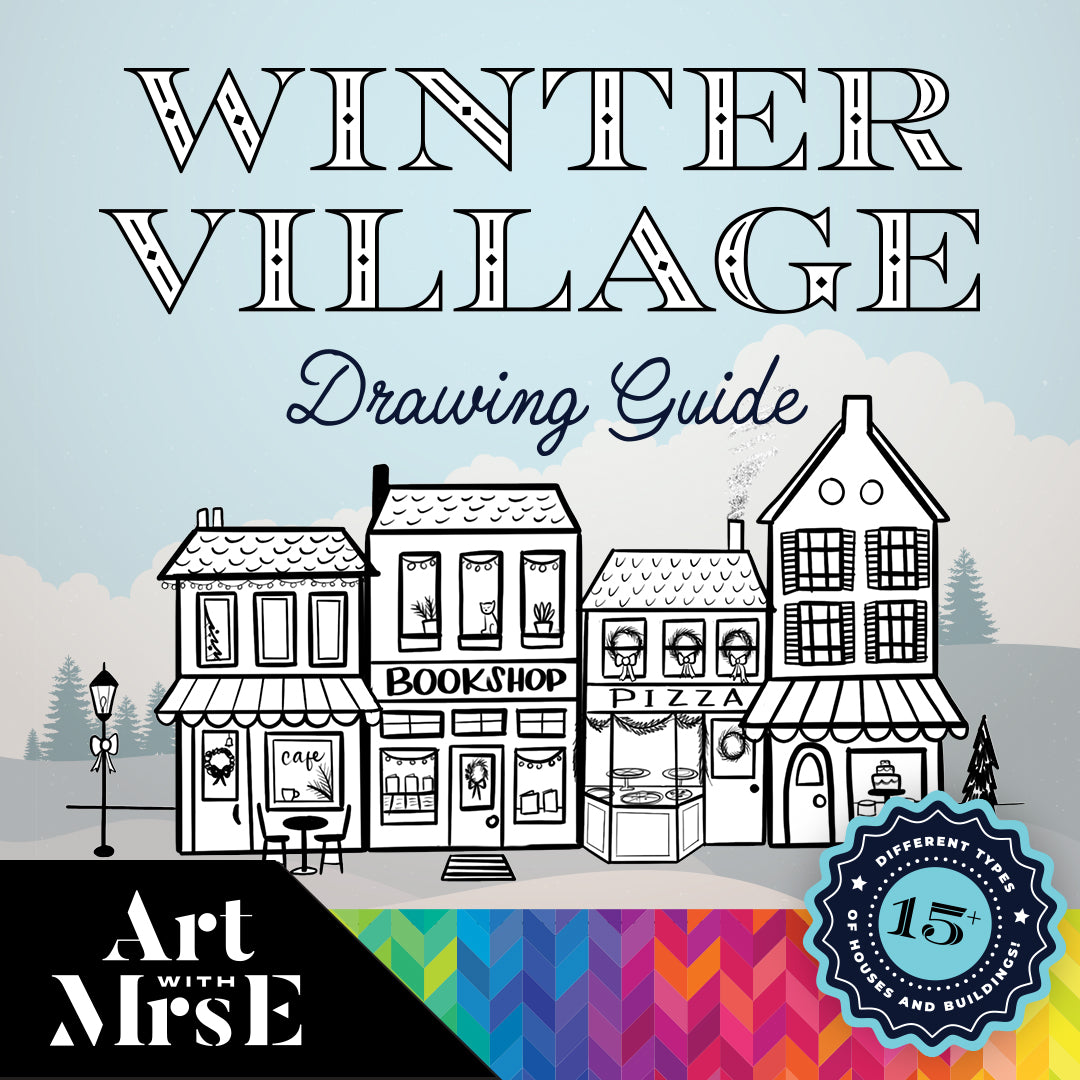
Winter Village Window Painting
Spread joy around your school by painting a simple winter village on the windows! It’s the most wonderful time of the year… window painting season! Or at least that’s what I say! This has been a little tradition I started all the way back my first year teaching in 2008 (😳). For me, painting the windows is such an easy way to spread joy to others. Not only is it incredibly relaxing to do as an artist, but be prepared to hear the “Ooos and Ahhs” as students and staff walk by admiring your window painting. I’ll never forget one of my students coming up to me at the end of the day and saying “Mrs. Edington, I was watching you paint those houses from my classroom and it was the joy of my day” 🥺❤️😭 Are you kidding me?? That right there is our way yall- to give kids the joy in their day! Let’s Get Started! Supplies: White tempera paint (I use Crayola Premier Tempera) Liquid hand soap (to be added to paint) Paintbrushes (soft bristle/ synthetic are best) Winter Village Drawing Guide (available in my TpT store) Adding soap to your paint can help with application and clean up! Add a bit of soap to your paint. This step is totally optional but when I shared these windows on my Instagram, the number one question I received was “WILL IT COME OFF??” Yessss yall- tempera paint is water-based and wipes right off! Sure you will have to spray and wipe a few times but it is far from permanent. Another option is to add a few pumps of soap to your paint and mix it in. This thins out your paint a bit and can make it appear a little more transparent, but when clean up comes around getting the paint off is a sinch! All you need is a straight razor blade and the paint with soap in it scrapes right off! It’s very satisfying if I do say so myself. Gather your brushes. I like using a variety of flat and round brushes of varying sized depending on the area I’m painting and the small details there are. My favorite classroom brushes are the Class Pack from Royal Langnickle (the green handles!) Print your Drawing guide and get started! Ok you guys- confession time. I have been obsessed with doodling cozy homes for years and years- just check my sketchbooks and you’ll see! So after spending the weekend in a quaint little town near us, I decided to capture the charm of the town and bring it to my students and my resources. Taking photos of all of the cute shops and homes in the town, I turned them into step by step drawing for artists of all ages to follow! You can download this guide here! Begin by painting the snow at the bottom of the window (a bumpy line) and then start painting your buildings! The more charm the better- consider adding lights, street lamps, trees, fences, feet prints and more! Whether you’re planning on painting this village in your classroom, around the school or even at home, I know that you and your little ones are sure to love it! Have fun!
Learn more
Botanical Plexiglass Painting
Is there anything more satisfying than painting on glass or plastic? I think not! That’s why plexiglass is the perfect surface to keep your students engaged while painting. A few days before my adapted class while chatting with my librarian pals, I noticed an extra standing piece of plexiglass in their storage room that was currently not in use. My brain instantly started spinning thinking of potential ideas of how I could use it in the art room. My students paint and print on small pieces of individually cut plexiglass all the time, so I’m no stranger to how wonderful plexiglass is- but I was so excited to have a large piece that was vertical! Thankfully my fabulous coworkers said I was happy to borrow the plexiglass for class so that’s what I did! Photo of Lucy Tiffney working (Source https://www.sofa.com/inspiration-corner/design-lab-lucy-tiffney/ ) When trying to figure out what it is we were going to paint on the plexiglass, I suddenly remembered artist and designer Lucy Tiffney who I had started following randomly on Instagram a few years back. Lucy is an artist, muralist, and designer with a distinct painterly style of vibrant botanicals and her work is just gorgeous! With our theme this year being the rainforest, I thought that Lucy’s work would be the perfect reference for this project in adapted art. So here’s how we did it! Materials: Plexiglass soft bristle paint brushes (I love Royal Langnickle brushes of all sizes) Tempera paint (if you plan on washing it off) I use Crayola Premier Tempera paint- the fluorescent colors are my favorite! Messy Mats & Smocks Reference images of Lucy’s work and plants 1. Prepare Your Materials and Work Space Prep your paint. Lucy obviously uses many different types of greens and blues, but she also uses different pinks for a pop in her work. So I prepared lidded ice cube trays with colors from Lucy’s palette mixed with a bit of white to make the paint nice and opaque on the glass. Prep the space I prepared the tables by covering them in my large messy mats with the plexiglass in the middle and Lucy’s work on my board as reference 2. Get Them Started Before my students arrived, I painted a few of the leaves/ botanicals around the edges to show them ahead of time what will be going on the surface. This is also a fun way to invite them into the lesson- when they came in and saw this interesting glass on the table with paint on it, they were ready to jump right in! 3. Demo How to Paint the Leaves then Let Them Do Their Thing! On a piece of scrap paper nearby I showed my students how to paint one long line for the stem and then add short lines on each side for the leaves. Some students really grasped the demo and others decided to paint whatever they wanted- and both were completely fine! As long as your students are safe, engaged, and hopefully having fun then that’s a win in my eyes! If the artwork happens to turn out lovely at the end then that’s a bonus! For my teaching adapted art is so much more about the experience for my students than the final product. Students sat on each side of the plexiglass which was really fun for them to see their peers across from them also painting the same surface! 4. Display Your Art! The best part about our plexiglass botanicals was showcasing how beautiful they turned out! Our wonderful librarian suggested we display our work in the windows of the library since we have large bright windows. It turned out to be the perfect space for our display and is enjoyed by every student in the school! Be sure to give plexiglass (or even window painting) a try! Your students are sure to love it!
Learn more
Oversized Symmetrical Sugar Skulls (Part 1)
Let's learn about the Mexican holiday, Dia de los Muertos by creating an oversized symmetrical sugar skull in art class! This lesson is hands on, fun and has the perfect books to accompany it!
Learn more
Collaborative “I am Human” Display
With Dot Day coming soon (September 15), I thought I would share another collaborative display that my students and I created a few years ago. For this display I decided to take Dot Day in a different direction and combine it with the amazing new book “I Am Human” by Susan Verde and Peter H. Reynolds. If you haven’t read it yet, this is a book all about what it means to show empathy, how we all have the ability as humans to make choices, learn from our mistakes and show kindness and compassion. Each student in our school “made their mark” by painting their self-portrait in the style of Peter Reynolds. This mural was inspired by the cover of the book with all of the small faces behind the main character. Peter Reynolds’ illustration from the book I Am Human, the inspiration for our school mural. I facilitated this mural with the help of my amazing specials team in the gym. I had a large piece of black bulletin paper laid out that was the length of the bulletin board I planned on displaying it on. I then used Crayola Premier tempera (regular & fluorescent) paint mixed with a bit of white paint to make the paint more opaque so that it would stand out on the black paper. I mixed each color of the rainbow, as well as the intermediate colors (red, red-orange, orange, yellow-orange, Yellow, etc..) in several container cups so that multiple students could paint at the same time (probably 3-4 cups of each color) and had them laid out along the side of the black paper in ROYGBIV order. In small groups, I had students come up to the black paper (starting at the top of the paper so they wouldn’t step in wet paint) and carefully paint a simple self portrait illustration similar to the style of Peter Reynolds, but also painted uniquely to represent each child. Once every student in the school had a chance to paint their portrait, I hung our rainbow portrait mural in our hallway with a line from the book that said: “I am Human. One of billions but unique”. My students loved finding their self-portraits and the impact this collaborative piece had in our hallway. If you decide to try a mural like this in your school, be sure to tag me on Instagram so I can see your amazing work!
Learn more
Dot Day Rainbow Display
Looking for the perfect collaborative art project for Dot Day? Celebrate creativity, courage, and school-wide connection with this Rainbow Dot Day Display inspired by The Dot by Peter H. Reynolds. Ideal for elementary art teachers, this vibrant monochromatic display uses simple materials like oil pastels, watercolor, and tempera to help students explore color theory and radial design. It's one of my most recreated Dot Day art lessons—sure to wow your school community and get everyone talking!
Learn more
Simple Portrait Back-to-School Bulletin Board
Need an Easy Back-to-School Bulletin Board Idea?Looking for a fun and meaningful way to fill your empty bulletin boards at the start of the school year? This creative self-portrait display was inspired by my own students—and made using my Simple Self-Portrait Drawing Guide! With just bulletin board paper, India ink, and a little imagination, I created life-sized illustrations to frame student artwork and build community right from day one. This project is low-prep, high-impact, and guaranteed to spark smiles!
Learn more
10 Must Have Teaching Visuals for the Art Room!
If you’re an elementary art teacher getting ready to set up your classroom, this is your ultimate guide to functional and fun art room visuals! From a modern Color Wheel poster to diverse Famous Artist displays, classroom expectation visuals, and supply labels designed with student needs in mind, these ready-to-use resources will help you transform your art space into a colorful, engaging, and educational environment. Whether you're a new art teacher or a seasoned pro, these art decor ideas will save you time and bring inspiration to your classroom. Explore the full Art Room Decor Bundle in my Teachers Pay Teachers shop!
Learn more
8 Tips For Setting Up Your Art Room
Just landed your first art teaching job? Whether you're setting up your first classroom, teaching from a cart, or somewhere in between, this guide is packed with practical tips from a veteran art teacher. From classroom management and organizing student artwork to creating an inspiring space and building relationships, these 8 simple strategies will help you feel confident and ready for back to school!
Learn more